Liquid IV
Challenge:
As America’s top hydration company, Liquid IV requires a brand identity that reflects this reputation while still resonating with consumers. Here’s my vision for a new brand identity and launch campaign that will elevate their marketing efforts.


Logo redesign
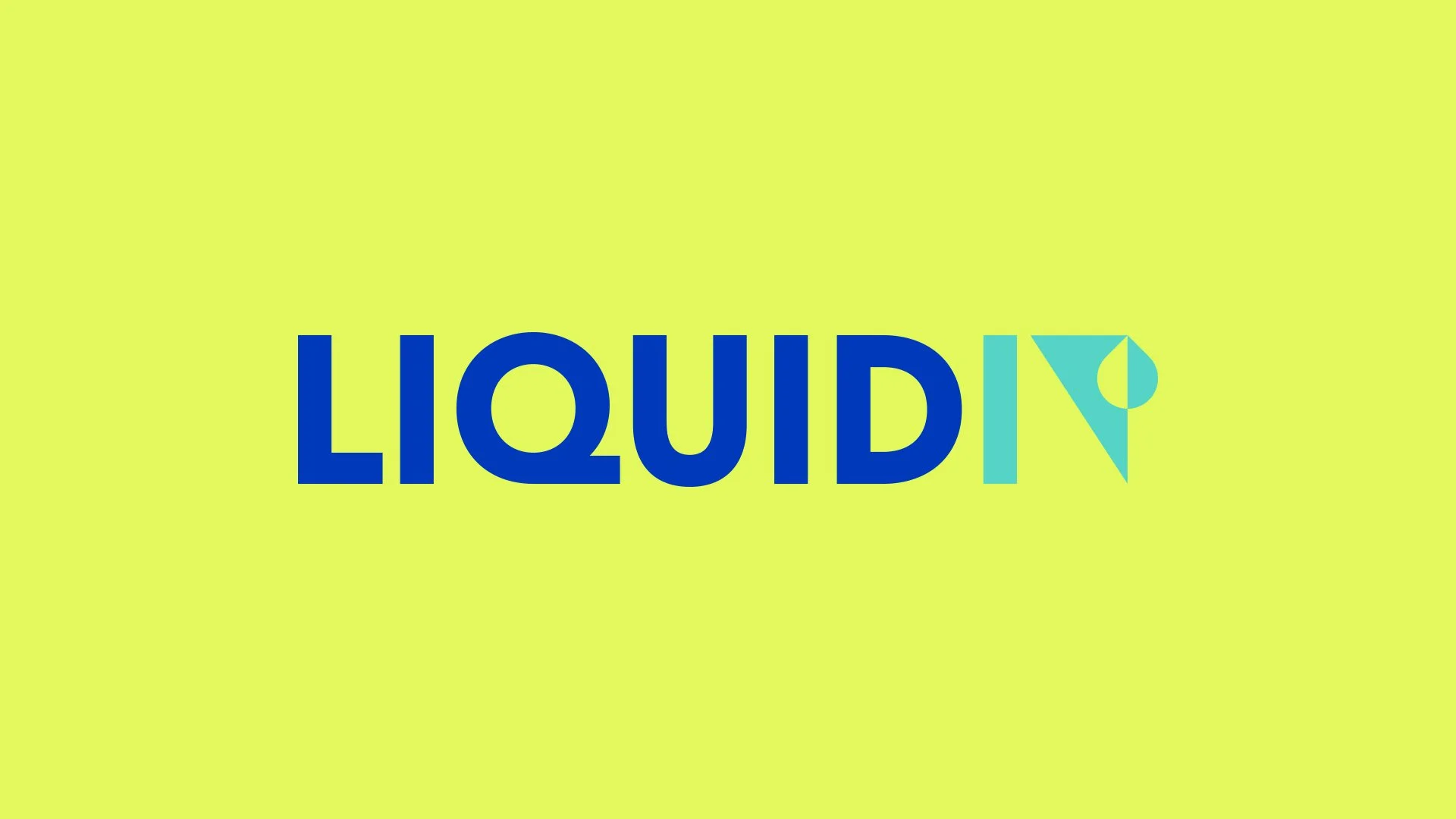
I aimed to achieve the perfect balance between evolution and heritage in Liquid I.V.'s logo redesign — modernizing the mark while preserving its most recognizable elements. The refined logo transforms the "I" and "V" into a cohesive graphic element, using negative space to cleverly reveal a drip within the "V." The result is a cleaner, more versatile mark that preserves instant brand recognition while feeling sharper and more contemporary, making it ideal for scaling across packaging, digital, and beyond.
Modular patterns
Building on Liquid I.V.’s refreshed logo, I developed a versatile pattern system using its core geometric shapes — transforming them into a modern, scalable design system. The clean, angular forms reflect the precision of the logo’s “IV" drip motif but with a dynamic twist: interchangeable shapes and colors that adapt to each product flavor. Whether vibrant citrus or cool berry, the patterns maintain consistency while allowing for distinct visual identities.


Campaign approach
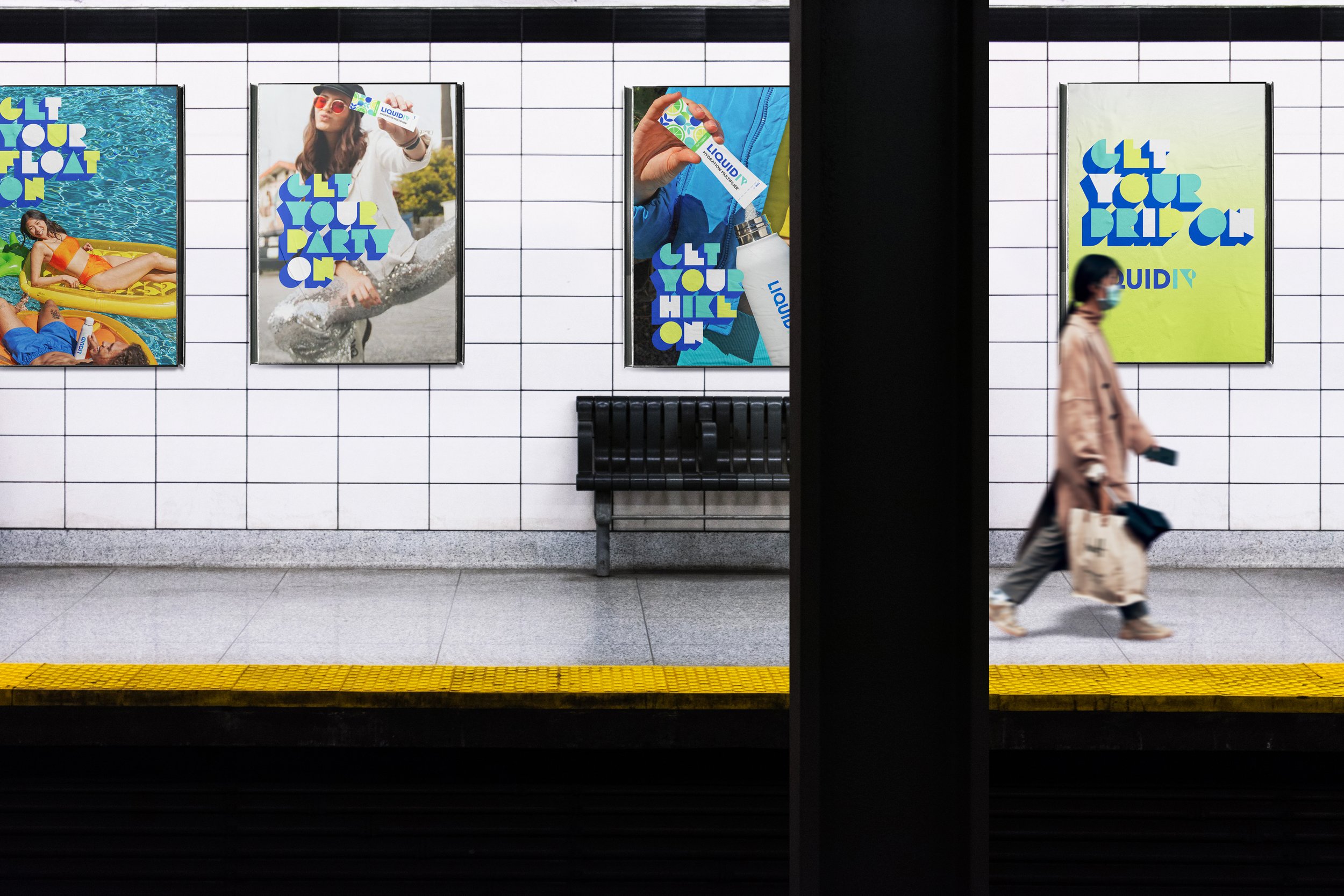
Life doesn’t stop — nor should your hydration. "Get Your Drip On" celebrates the daily hustle by placing Liquid I.V. at the heart of every activity, from gym sessions to late-night work marathons. The campaign transforms "drip" (referencing IV drips and a slang term for style) into a double-meaning mantra: Whatever you’re doing, Liquid I.V. fuels your flow.
Get Your Drip On
•
Get Your Drip On •


Award-winning creative leader driving business growth through progressive brand initiatives, inclusive team leadership, and hands-on design direction.