Pawz
Challenge:
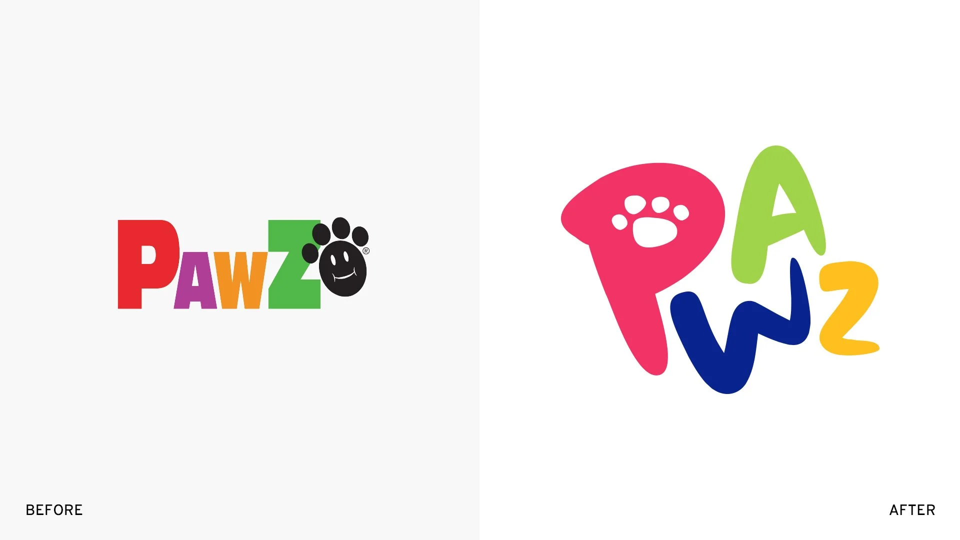
As a dog dad, I understand the importance of clean and healthy paws, and Pawz Rubber Dog Boots are the only ones that stay on for us. Here’s my take on a playful rebrand that aims to elevate the Pawz brand from a practical product to a beloved lifestyle brand.
Logo approach
I replaced Pawz's original bold sans serif with a hand-drawn font, which infuses the logo with a playful personality that better reflects their product spirit. The strategic repositioning of their paw icon; moving it from its disconnected placement at the end into the counter space of the "P". This subtle yet significant change establishes a more cohesive, memorable mark that communicates functionality and whimsy.
Dimensional brand language
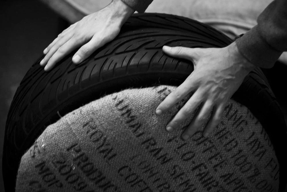
Building on the rounded aesthetics of the redesigned logo and honoring the product's material essence, I developed a dimensional 3D rubber version of the mark for advertisements and brand applications. This tactile interpretation creates immediate material recognition while enhancing visual appeal. These design elements form a consistent visual language that reinforces the product's rubber composition while extending the playful brand personality and memorability across all touchpoints.
These boots are made for walking
〰️
These boots are made for walking 〰️
Award-winning creative leader driving business growth through progressive brand initiatives, inclusive team leadership, and hands-on design direction.


