Lucky Boys
Challenge:
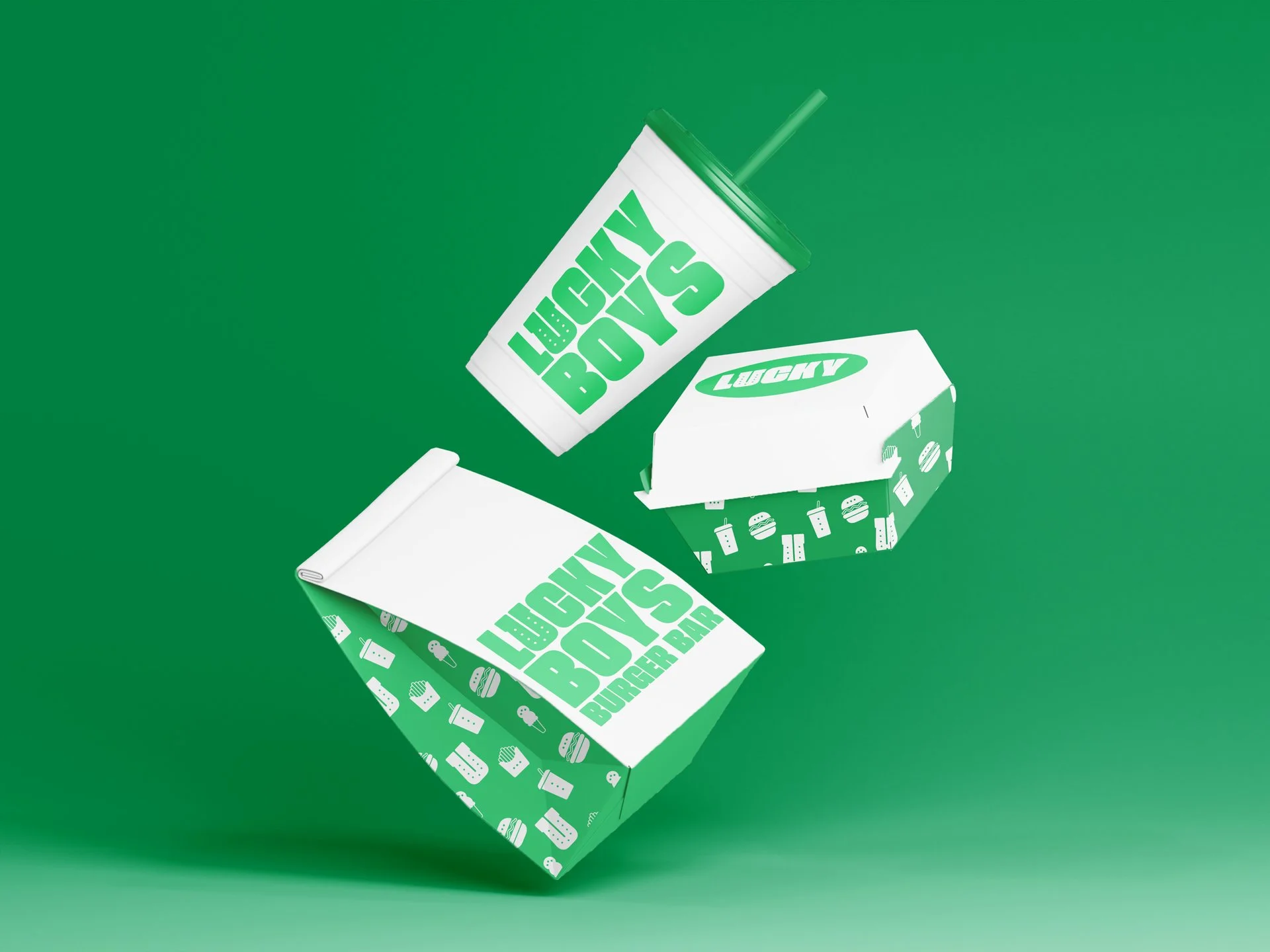
The burgers at Lucky Boys speak for themselves, but their brand identity remains silent. Here’s my take on a bold new look that will help bring this neighborhood favorite into the 21st century.
Logo redesign
I transformed Lucky Boys’ identity by embedding a clever visual pun into their wordmark. The "U" in "Lucky" subtly morphs into a horseshoe, instantly recognizing the brand’s lucky charm persona. This minimalist approach keeps the logo clean and scalable for everything from burger wrappers to neon signs while adding a layer of personality that sets it apart from typical fast-food branding.
Monochromatic branding
I embraced a bold design constraint: building an entire burger brand identity using just green, black, and white. This radical limitation became the creative catalyst. The vibrant green - reminiscent of fresh produce and lucky clovers - instantly pops against the high-contrast backdrop, making wrappers and signage unmistakable.
Come Get Lucky
Ω
Come Get Lucky Ω
Award-winning creative leader driving business growth through progressive brand initiatives, inclusive team leadership, and hands-on design direction.


